This week, I thought I’d spotlight one of my favorite pieces in our current exhibition, Technicolor Summer.
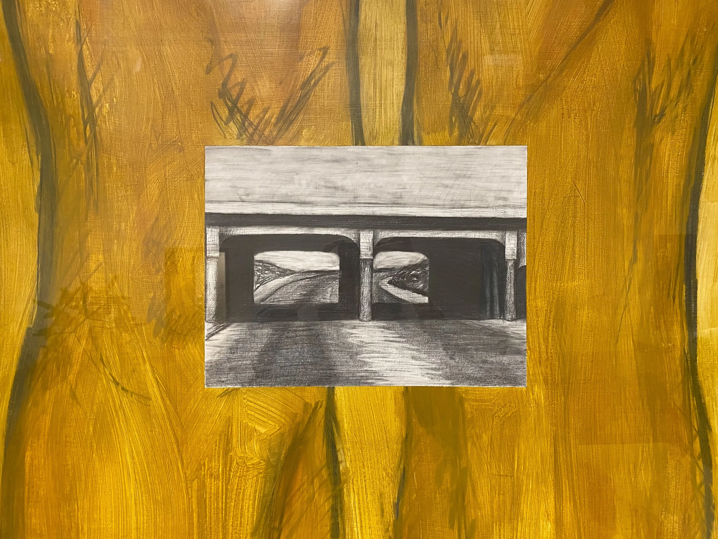
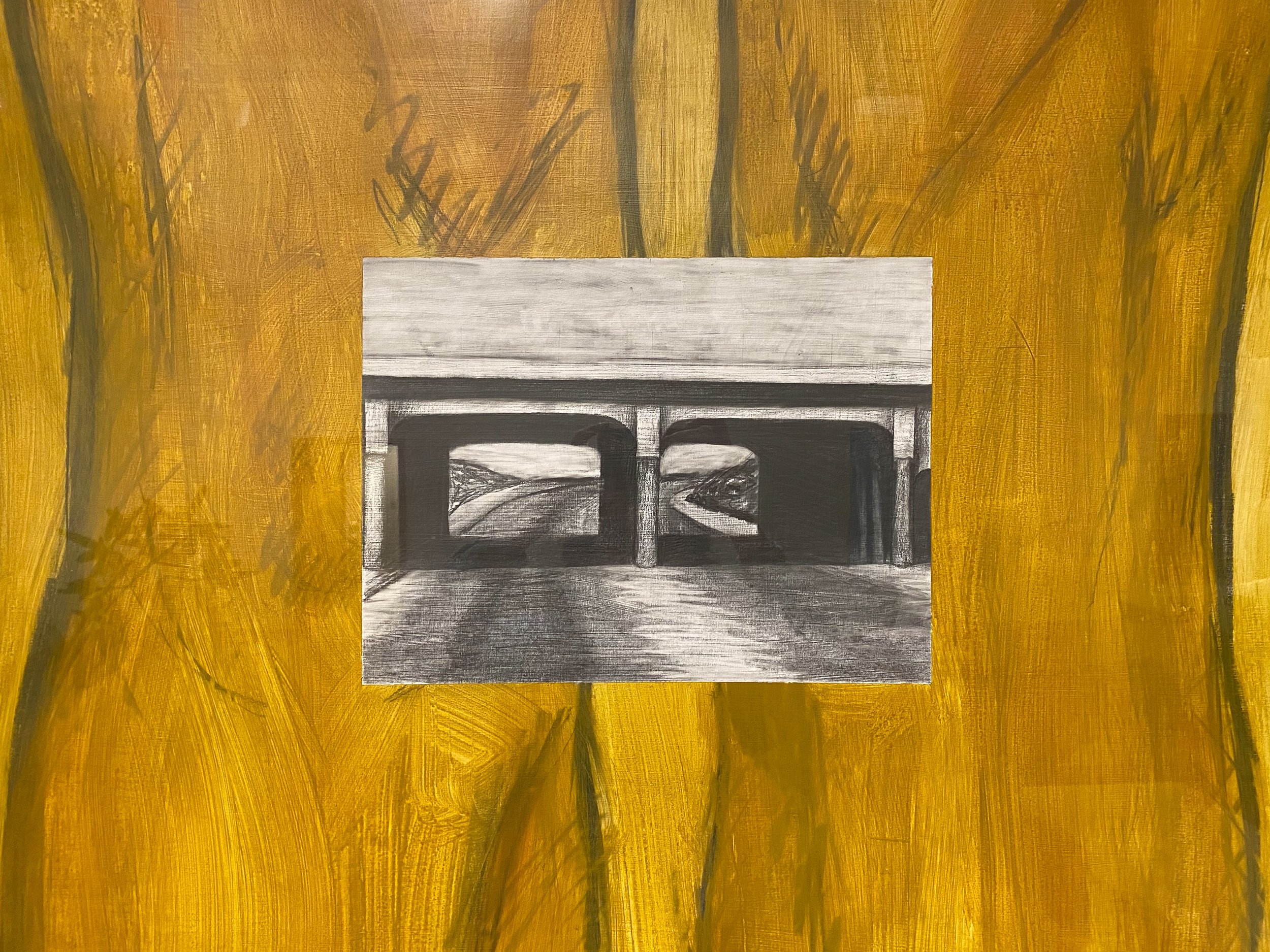
This acrylic painting is titled “Standing Plans.” It was created by artist David A. Cook in 1988. Standing over 7 feet tall, it’s the largest work of art in this exhibition, but besides it’s impressive size, I think there are three elements that make this composition engaging: negative space, contrast, and placement.
Negative space is basically all of the empty room around an object. So, for example, if you see a photograph and ¾ of the photo is just of the sky, that photo might be said to have a lot of negative space. Cook utilizes this element with all of the empty space surrounding the legs. With nothing to distract in the background, it draws our focus to the two subjects in the foreground and it makes them really pop and stand out.
Another important component of this painting is contrast. The two subjects here- one big and one small- have highly contrasting scales and colors. The legs are portrayed as huge and very boldly yellow, while the image of the highway overpass is small, dark, and entirely monotone. This contrast of size and color makes it feel as if two images kind of fight each other visually. Almost like an entirely different work of art has been collaged on top of another instead of part of the same painting! This visual disparity may encourage the viewer to brainstorm a possible non-visual connection between them. I found myself wondering about context and artist intent.
Overall I think the element that impacts this composition the most is placement. The artist could have chosen to put the small, monotone image anywhere in this painting, but Cook placed the monotone overpass directly over the knees. Was there a reason for that choice? I started brainstorming about connections between roads and legs, about movement, direction, and change. I wondered if the overpass represented something dark like a bad memory or emotion you’re trying to move on from or a visual of knees locking in terror. I don’t know the meaning behind this placement, but it feels intentional enough to be important.
Honestly, we don’t have a lot of information regarding Cook’s intent, but it’s definitely fun to just sit in front of this giant work and brainstorm the choices behind its fun and super engaging composition.
Kirsten Hahn
Education Programs Coordinator


